Ship Faster with Shadcn/ui: The Component Library Every Vibecoder Should Know
Stop reinventing the wheel. Build production-ready UIs in hours, not days.
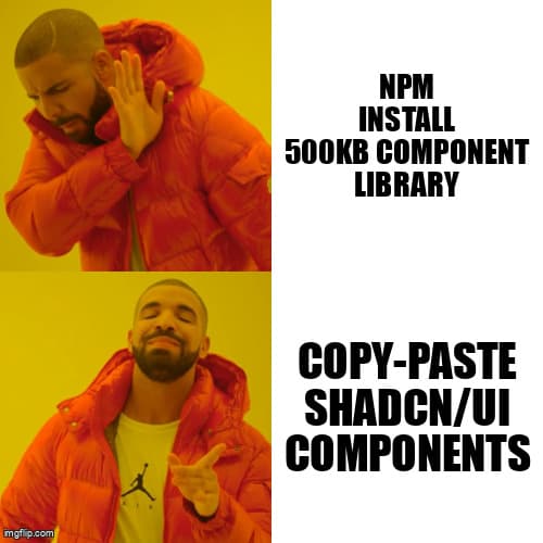
The Copy-Paste Revolution
You're vibecoding a SaaS dashboard at 2 AM. You need a data table with sorting, filtering, and pagination. Your options: spend 6 hours building it from scratch, or npm install a 500KB component library that dictates your entire design system.
There's a third way. Shadcn/ui isn't a traditional component library. It's a collection of copy-paste components you own completely. No package bloat. No version conflicts. Just beautifully designed components that land directly in your codebase, ready to customize.
For solo developers using Lovable, v0, Cursor, or Claude Code, this is the missing piece. You get the speed of pre-built components with the flexibility of custom code. Let's see how it works.
Why Shadcn/ui Hits Different
Traditional component libraries like Material-UI or Chakra are dependencies. They ship bundles, manage versions, and enforce opinions. Shadcn/ui is different:
- You own the code: Components copy directly into your project. Modify them without fighting the library.
- Zero dependencies (almost): Built on Radix UI primitives and Tailwind CSS—tools you're likely already using.
- Accessible by default: Every component follows WAI-ARIA standards. Keyboard navigation, screen readers, focus management—all handled.
- Themeable instantly: Change your entire design system by editing CSS variables. No prop drilling, no style overrides.
- Framework agnostic: Works with Next.js, Remix, Vite, Astro—any React setup.
The philosophy is simple: ship components so well-designed that copy-pasting them is faster than building from scratch, but you still have full control.
Getting Started in Under 5 Minutes
Let's add shadcn/ui to a Next.js project. If you're using Lovable or v0, you can adapt these steps to your environment.
Step 1: Initialize shadcn/ui
npx shadcn@latest init

# Answer the prompts:
# ✓ Which style would you like to use? › New York
# ✓ Which color would you like to use as base color? › Slate
# ✓ Would you like to use CSS variables for colors? › yes
This creates a components/ui/ directory and configures Tailwind. It takes 30 seconds.
Step 2: Add your first component
npx shadcn@latest add buttonNow you have a components/ui/button.tsx file in your project. It's yours. Modify it however you want.
Step 3: Use it
import { Button } from "@/components/ui/button";

export default function HomePage() {
  return (
    <Button variant="default" size="lg">
      Deploy Now
    </Button>
  );
}
That's it. No wrapper components, no theme providers, no config files. Just import and use.
Real-World Example: Building a Dashboard in 2 Hours
Let's build something realistic: a SaaS metrics dashboard with cards, charts, and a data table. Here's what you need:
npx shadcn@latest add card table badge avatar dropdown-menuFive components. Five seconds. Now let's compose them:
import { Card, CardContent, CardHeader, CardTitle } from "@/components/ui/card";
import { Badge } from "@/components/ui/badge";
import { Table, TableBody, TableCell, TableHead, TableHeader, TableRow } from "@/components/ui/table";

export default function Dashboard() {
  return (
    <div className="grid gap-4 md:grid-cols-3">
      <Card>
        <CardHeader>
          <CardTitle>Total Users</CardTitle>
        </CardHeader>
        <CardContent>
          <div className="text-3xl font-bold">12,345</div>
          <Badge variant="success">+12% from last month</Badge>
        </CardContent>
      </Card>

      {/* Repeat for more metrics */}

      <Card className="col-span-3">
        <CardHeader>
          <CardTitle>Recent Activity</CardTitle>
        </CardHeader>
        <CardContent>
          <Table>
            <TableHeader>
              <TableRow>
                <TableHead>User</TableHead>
                <TableHead>Action</TableHead>
                <TableHead>Time</TableHead>
              </TableRow>
            </TableHeader>
            <TableBody>
              <TableRow>
                <TableCell>john@example.com</TableCell>
                <TableCell>Deployed app</TableCell>
                <TableCell>2 min ago</TableCell>
              </TableRow>
            </TableBody>
          </Table>
        </CardContent>
      </Card>
    </div>
  );
}
This would take hours to build from scratch. With shadcn/ui, you wrote 40 lines of code in 20 minutes. And it's production-ready: responsive, accessible, and beautiful.
Forms That Don't Suck
Forms are where most UI libraries fall apart. Too much boilerplate, weird validation patterns, styling headaches. Shadcn/ui nails it with React Hook Form integration:
npx shadcn@latest add form input labelimport { useForm } from "react-hook-form";
import { zodResolver } from "@hookform/resolvers/zod";
import * as z from "zod";
import { Button } from "@/components/ui/button";
import { Form, FormControl, FormField, FormItem, FormLabel, FormMessage } from "@/components/ui/form";
import { Input } from "@/components/ui/input";
const formSchema = z.object({
email: z.string().email(),
password: z.string().min(8),
});
export default function LoginForm() {
const form = useForm({
resolver: zodResolver(formSchema),
});
return (
<Form {...form}>
<form onSubmit={form.handleSubmit((data) => console.log(data))}>
<FormField
control={form.control}
name="email"
render={({ field }) => (
<FormItem>
<FormLabel>Email</FormLabel>
<FormControl>
<Input placeholder="you@example.com" {...field} />
</FormControl>
<FormMessage />
</FormItem>
)}
/>
<Button type="submit">Sign In</Button>
</form>
</Form>
);
}Validation with Zod, error handling, accessible labels—all in one coherent pattern. You can ship this to production today.
Pro Tips for Customization
Since you own the code, you can customize without limits. Here are patterns that save time:
1. Theme with CSS Variables
Edit app/globals.css to change your entire color scheme:
@layer base {
  :root {
    --primary: 222.2 47.4% 11.2%;
    --primary-foreground: 210 40% 98%;
    --destructive: 0 84.2% 60.2%;
  }
}
Every button, card, and form instantly updates. No prop changes required.
2. Create Variants
Need a branded button? Edit components/ui/button.tsx:
const buttonVariants = cva(
  "inline-flex items-center justify-center rounded-md text-sm font-medium",
  {
    variants: {
      variant: {
        default: "bg-primary text-primary-foreground",
        branded: "bg-gradient-to-r from-purple-500 to-pink-500 text-white",
      },
    },
  }
);
Now use it: <Button variant="branded">Launch</Button>
3. Compose Complex Components
Build higher-level components by combining primitives. Need a user menu? Compose Avatar, DropdownMenu, and Button:
import { Avatar, AvatarFallback, AvatarImage } from "@/components/ui/avatar";
import { DropdownMenu, DropdownMenuContent, DropdownMenuItem, DropdownMenuTrigger } from "@/components/ui/dropdown-menu";

export function UserMenu() {
  return (
    <DropdownMenu>
      <DropdownMenuTrigger>
        <Avatar>
          <AvatarImage src="/avatar.png" />
          <AvatarFallback>JD</AvatarFallback>
        </Avatar>
      </DropdownMenuTrigger>
      <DropdownMenuContent>
        <DropdownMenuItem>Profile</DropdownMenuItem>
        <DropdownMenuItem>Settings</DropdownMenuItem>
        <DropdownMenuItem>Sign Out</DropdownMenuItem>
      </DropdownMenuContent>
    </DropdownMenu>
  );
}
When to Use Shadcn/ui
Shadcn/ui shines in specific scenarios. Use it when:
- You're building a unique brand: Unlike Material-UI or Bootstrap, shadcn/ui doesn't scream "I used a template."
- You need full control: Since components live in your repo, there's no version lock-in or breaking changes.
- You're shipping fast: Solo developers and small teams benefit from pre-built patterns without sacrificing flexibility.
- Accessibility matters: Every component is built on Radix UI, which handles complex accessibility patterns.
Avoid it if you need mobile-native components (React Native) or a design system mandated by external stakeholders who want a specific library.
The Vibecoder's Secret Weapon
Here's the truth: vibecoding is about momentum. When you're building a SaaS solo, every hour spent on UI polish is an hour not validating your idea. Shadcn/ui lets you ship production-grade interfaces without the overhead of traditional component libraries.
Combine it with AI coding tools like Cursor or Claude Code, and you're unstoppable. Prompt your AI: "Build a user settings page with tabs, form inputs, and a save button using shadcn/ui." Watch it generate production-ready code in seconds.
The components are well-documented, so AI models understand them. The patterns are consistent, so generated code rarely needs tweaking. This is the stack that turns ideas into live products in days, not months.
Start Shipping Today
Stop debating which component library to use. Stop building buttons from scratch. Copy, paste, customize, ship.
Shadcn/ui isn't magic—it's just really good components that respect your time and your codebase. For solo developers vibecoding their way to product-market fit, that's exactly what you need.
Initialize shadcn/ui in your next project. Add a few components. See how fast you can build a dashboard, a landing page, a full admin panel. Then ship it.
The best component library is the one that gets out of your way. Shadcn/ui does exactly that.